Article Summary
What is a Heatmap?
- Data analysis software
- Uses colours as a data visualization tool
- Visual way to make decisions from
- Helps tweak your web page for efficiency
If you haven’t tried using any visual data analysis software, well, you’re missing quite a lot in trying to measure your online data.
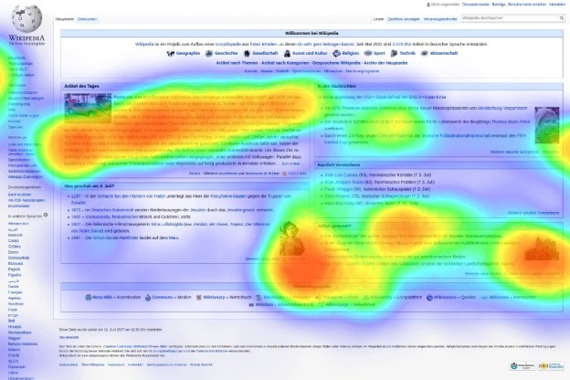
What is so unique about this application is that you can pinpoint exactly which area of your page is being frequented by your visitors.
If you run a business or manage a sales and marketing team, you know how important efficiency is. There are countless ways to optimize operating costs or a combination of both.
But one of the most effective ways to improve sales and marketing results is to understand geographical and customer data and use it to your advantage. This is where heat maps come in.
It takes numeric data and plots it on an accurate geographical map, displaying different values by color intensity. The point of a heat map is to give visually inclined teams a precise idea of their current results and where they can improve based on what the map describes.
How does it work?
Let’s take for example that you are looking at a particular webpage, a heatmap will show you which areas of that page are getting the most attention.
Seeing this will help you streamline your page so that the most important part gets the most notices.
A heat map can display the following data:
- Your most clickable headline
- Most attractive image and if people are clicking on it
- What distracts visitors from your web page
- Do people see your call to action or opt-in box?
Colours as Visualization tool
The way the Heatmap works is that certain colours are associated with actual cursor “clicks”. The intensity ranges from darkest (fewest to no clicks or browse) to lightest indicating the most clicks or browse.
The cool thing about using this tool is that you can continue to tweak your page to update them until you are satisfied with the result.
Once you have implemented this tool, you can easily integrate it to your business workflow, making it an integral part of your analytics.
The good thing about using heatmap is that organizations can use it in different ways depending on their goals and they can also pinpoint productivity, marketing efforts and any other considerations that need numerical tracking.
Do you think this tool is for your business? Absolutely, especially if you’re keen on tweaking your web page to deliver the best version that could make people interact with it in a superb way.
